PORTFOLIO OF PRINT DESIGNS
In every example below, Nancy Wirsig McClure was responsible for the visual concept (developed from the client's brief),
design & layout, creation of original digital art, and production (building print-ready files).
Contact the designer: send a message to Nancy using this form.
AD AND POSTER DESIGN
Quarter-page ad for tabloid-size trade publication. The project brief requested that the visuals communicate a sense of success to the readers — managers of software development. Nancy selected the stock photo, simplified and faded it, and added the upward trend line. The brief also specified approximately equal weight for the headline, sub-headline, and company logo, and Nancy made that fit the layout. |
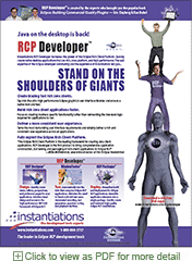
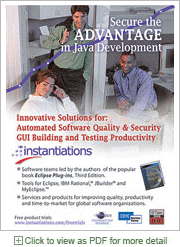
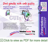
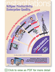
Full-page ad for trade publication, announcing a new product. The project brief requested that the ad communicate a sense of the value of tools that extend the open source Eclipse platform. Nancy borrowed the headline from Isaac Newton and created the image that interpreted it concretely. The brief also required inclusion of lots of text, and Nancy divided the layout into areas that make it more accessible. |
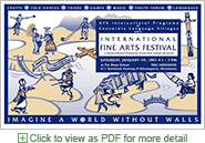
Poster for event. The client's brief was to communicate multcultural excitement. Nancy created the illustration as well as the layout. This is an old favorite because it represents one of Nancy's first uses of digital prepress (1990!) |
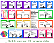
Wall reference poster. An exercise facility needed a poster to hang over the stretching area, showing how each stretch was done. Silhouette art (created by Nancy) was prefered to photographs to highlight the key aspects of each position. |
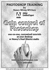
Quarter-page ad for a newsletter. In the late '90s, using software was new to many photgraphers. So the newsltter of ProPhoto Supply mostly had ads for services and equipment. Nancy's ad, with its simple use of hand-on-mouse, stood out as being about software (as well as playing on her business name, hand2mouse). The textured background was clearly digitally composited with the photo, silently supporting the claim of Photoshop expertise. |
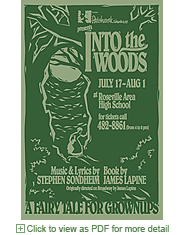
Poster for a musical. The brief was to attract attention and to reinforce the director's interpretation of this Sondheim show, "a fairy tale for grownups." The non-profit community theatre got the printing donated, but it was only one color printing. Nancy made the best use of the limitations by choosing dark green ink and medium-gray-green paper. |
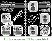
Magazine ad for a half-page in a one-color publication. Client's brief was to create some interest around admittedly boring replacement parts for dry cleaning machines. Nancy's artwork simulates 3D: a ring-bound photo album (with a Post-It note). |
Ad for conference's program book (back cover). The brief was to catch attention while using the existing product artwork. Nancy used depth to suggest that the new product follows on the existing (widely used) product. She also suggested the headline, tied to the booth's "wheel of fortune" promo. |
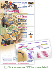
Mailer/poster for an event. The client's brief requested that the piece work as a mailer that summarizing the event before unfolding, and as a poster when unfolded. Nancy created the montage of elements that suggested web design (this was early in the history of the web, when most design was assumed to be for print). The piece is two sides, full bleed, digitally printed. |

Full-page ad for trade publication. The project brief requested an ad format that would work for future testimonials for various products. It needed to emphasize the real person and his quote, but also highlight the product name and offer the product benefits. Nancy cut the figure out of the original photo and layered him with his quote on a semi-transparent shape and a background from stock photography. |
MARKETING COLLATERAL (postcards, sell sheets, etc.)
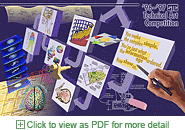
Call for entries in a competition for technical artists. The artwork, created by Nancy, shows many of the types of artwork accepted -- permitting the design to avoid a textual laundry list.
|
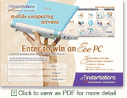
Conference bag insert promoting a prize drawing. The brief focused on the prize (a then-new and unfamiliar netbook). Nancy selected images accordingly. The hand + netbook shows its small size and the screenshot shows its fun interface.
|
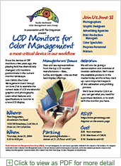
Flyer-poster for a professional association's presentation. Nancy developed a layout, using the association's logo, to be used as a template and varied every month. It allows for changes in text, font and color scheme along with content and illustration. Nancy created the photo montage to illustrate the them of comparing flat panels and add some excitement. The use of red, green and blue is a subtle reinforcement of the group's identity with color management. |
Handout at a trade show. The brief was to show the company's products and their relationships to the software development process. It also requested a secondary element promoting a presentation by book authors who work there. Nancy created the "product arc" using the products' existing artwork and type treatments. This 6x9" piece is for the same event as the bag insert above, so it shares a background color. |
PUBLICATION AND DOCUMENT DESIGN
Additional examples — catalogs and more —available on request.
Project proposal submitted in response to a RFP. It includes tables and left-margin placement of subheads. Two colors, 12 single-sided pages, for printing on a desktop printer. |
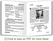
Program book for a conference. Nancy did all the production, including many threaded stories and varied section layouts. She selected a playful display font tied to the "readers of mystery" audience. One color, digitally printed, perfect bound. |
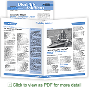
Newsletter. Two colors, eight pages, with bleed. The PDF file is a mockup (with dummy contents) to show layout plans. A template file was delivered to client in PageMaker format, along with a style guide. Nancy also designed the logo and banner for the newsletter. |
White paper explaining a high technology topic. Eight pages, one color. Designed without bleed to fit on tabloid-size paper and then folded and stapled. Nancy specified printing on a high-end slightly-textured paper to match the expensive computer security topic. |
Brochure. Client's brief: describe membership benefits for a professional association, using existing logo. Designed so that removing the reply form doesn't remove essential info! One color for xerox reproduction on letter-size paper. Two sides, tri-fold, to fit in a No.10 envelope. |
Dance program formatted as a wrist booklet of 15 pages. One color and no bleed for inexpensive printing. Designed with no running heads, accommodating the hole punch. |
EXHIBIT & PRESENTATION DESIGN
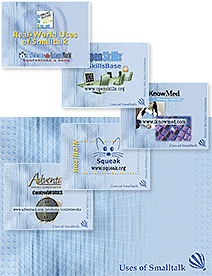
Slides for a presentation. The client needed help putting the entire show together as well as design help. The talk was a survey of many organization's uses of a technology. Nancy captured logos (mostly from web PDFs), and found images for their applications (from their sites or from stock showing the concepts). Nancy created a background with layering — but low-contrast to avoid fighting with the many foreground images.
|
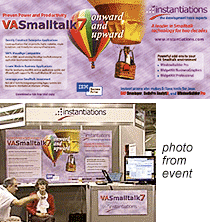
Tradeshow booth graphics. The brief was to create a strong booth presence while avoiding international shipping. Nancy created visuals that The striped balloon is a longstanding visual theme for Smalltalk. Nancy refreshed it with an added balloon and also conceived the headline. |
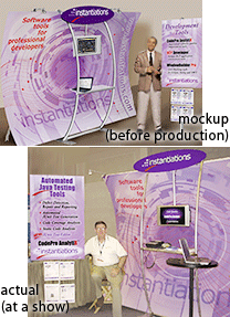
Trade show booth design. After the client chose the booth product, Nancy began with the company's logo and color scheme. She used abstract artwork (derived from an istockphoto graphic) to create a sense of dynamism, This was applied to the fabric elements — the booth's back panel and the freestanding signs. Nancy sent production files to the booth manufacturer. |
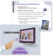
Slides for a use by a webinar's presenters. Nancy designed backgrounds for a title slide and other slides and created a PowerPoint template. She also created graphic elements such as the demo indicator, and made them available as objects in the PPT file. The template and graphic elements was used by presenters to create their presentations for a real-time web seminar. |
PACKAGING DESIGN
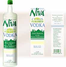
Design for bottle label for beverage product. The client was preparing a business plan for a niche distillery and wanted an impressive package to show to prospective funders. Nancy's brief was to design labeling that looked like a real product and a mockup based on an existing bottle's form factor. The illustration she created was used in the business proposal, but the distillery was never launched. |
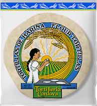
Bag for retail food product (fresh tortillas). The client's brief included some semi-primitive mexican artwork whose style they liked. Nancy created artwork for wheat and corn tortillas, emphasizing their different ingredients (see "corn" on the side of the truck below). Nancy produced all the files used by the bag printer, including the back with ingredients and nutritional labeling. |
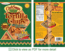
Bag for retail food product (chips). The client's brief asked for fun, new and somewhat ethnic. Nancy suggested illustrating the chips in a bowl, since the actual chips (seen in this mockup through "clear" windows in the artwork) are an odd color — being low-carb and high in soy. There were also many text qualifier to include — brand name, flavor, carb count, etc. Part of the design keyed off the company's oval logo. |
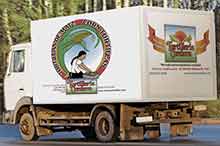
Vehicle graphics. The tortilla bakery (above) also had a delivery van. Nancy prepared the files for the graphics vendor. They used the artwork from one of the products on the side
|
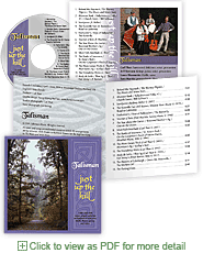
Music CD packaging. Nancy designed the coordinated pieces, using provided photos and stock imagery of celtic knotwork. She created a calligraphic treatment of the album name to relate to the group's logo. She built print-ready files for the booklet (4-over-1 full bleed), the tray card (1-side color),and the 3-color screenprinting for the disc — all seen in the PDF (found by clicking on the image). |
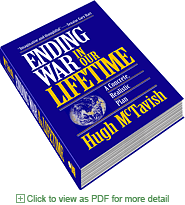
Book cover, both paperback and hardcover. The author and self-publisher wanted the gravitas of a serious political science book with a chance for the title to grab attention, despite its wordiness. Nancy designed and laid out the front cover, the back cover, and the jacket flaps for the hardback. Files were sent to the author's vanity publisher to be printed in two colors. |