

PORTFOLIO OF PRINT
DESIGNS: ADS & POSTERS
 Print Portfolio
- Ads & Posters
- Collateral
- Presentations & Exhibits
- Packaging
In every example below, Nancy Wirsig McClure was responsible for the visual concept (developed from the client's brief),
design & layout, creation of original digital art, and production (building print-ready files).
Additional examples available on request (to view as printed samples).

Quarter-page ad for tabloid-size trade publication. Project brief: communicate a sense of success to managers of software development. Nancy selected the stock photo, simplified and faded it, and added the upward trend line. |
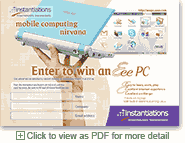
Conference bag insert promoting a prize drawing. Project brief: focus on the prize (a then-unfamiliar netbook). Nancy selected the hand + netbook to show its small size and the screenshot to show its fun interface. |
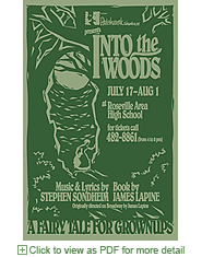
Poster for a musical. Project brief: reinforce the director's interpretation of this Sondheim show, "a fairy tale for grownups." Nancy maximized the limited palette of one-color printing with her ink and paper choices. |

Full-page ad for trade publication. Project brief: an ad format that will work for future testimonials. Emphasize the real person and his quote, but also highlight the product name and offer the product benefits. Nancy cut out the figure and layered him and his quote on a semi-transparent shape. She added a background from stock photography. |
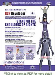
Full-page ad for trade publication, announcing a new product. Project brief: communicate a sense of the value of tools that extend the open source Eclipse platform. Nancy borrowed the headline from Isaac Newton and created the image that interpreted it concretely. The client required lots of text, and Nancy divided the layout into areas that make it more accessible. |
|